All Content
Created:
21-08-2021
Why designers pit Webflow and Figma against each other

I recently changed this article. Previously, it was "Why Webflow is probably the right platform for your next marketing site." Today, someone tweeted about how people should stop using Figma and switch to Webflow. Twitter was pissed 😅. It made me realize that I didn't want to be spewing that type of content. I never intended the previous article to read like that, but it probably did.
Webflow, like any other tool has a time and place. It is an amazing tool. Quite frankly, I think most "rapid" design tools will arrive in a similar place as time goes on (thinking about Plasmic and Framer). However, Webflow is definitely not the end-all-be-all of design tools.
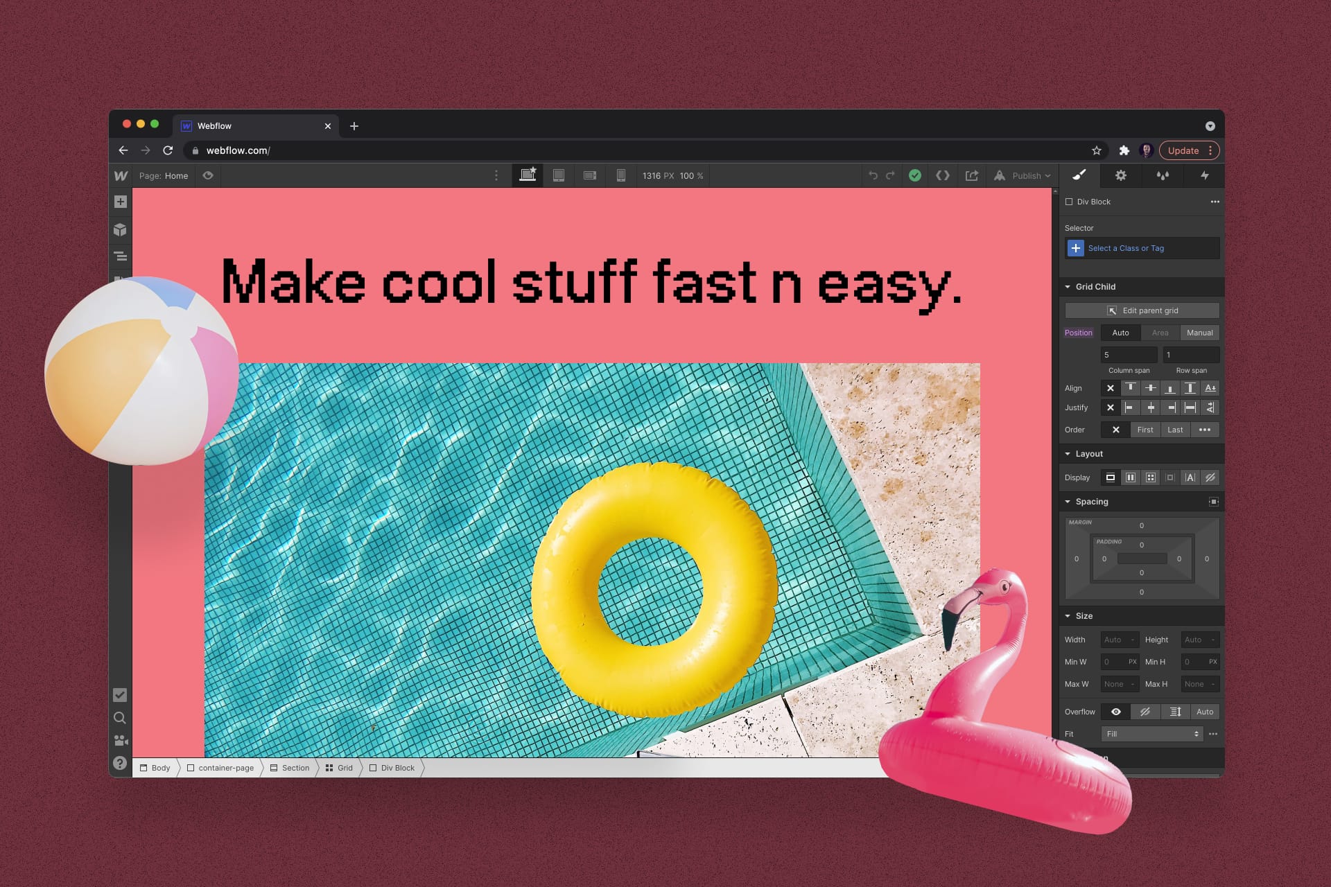
Webflow's strength is in its accuracy, detail, and level of customization. Designers can achieve things in Webflow that aren't possible in any other mainstream screen design tools such as responsive layouts, states, and interactions. Webflow allows designers to set a bunch of CSS properties that are otherwise hidden in most tools. Since designs in Webflow are 100% built and styled with HTML/CSS/JS it's easy to handoff "designs" (that are actually fully functioning websites) to developers.
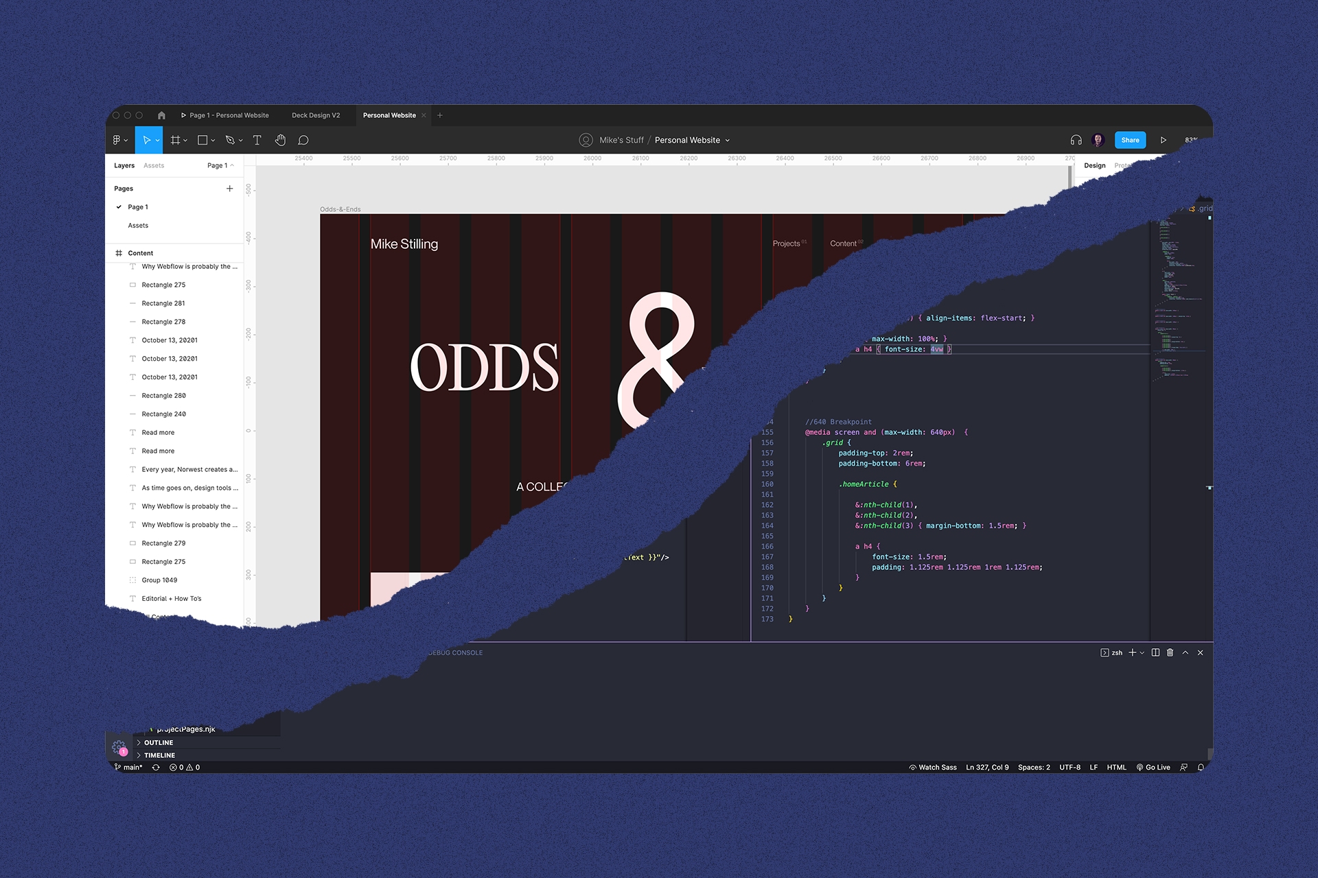
Webflow (like code) is not great for exploration since manually editing CSS takes forever and once it's "done" is a pain to change. This is where tools like Figma and Sketch step in and make life really easy. In Figma, designers can explore like 10 layouts in the matter of minutes or throw some squares with words in them together to map out a user flow. More or less, Figma and Sketch are great for initial design phases.
Why Webflow vs. Figma is a thing... And why Sketch doesn't have this problem.
Figma's capabilities are getting closer and closer to that of a an actual app or website's front-end. Due to that, the level of effort involved in creating "final" designs in Figma is increasing, especially with auto-layout and built-in prototyping. Pair all of those with proper naming and layer management to align with a design system that should also correlate to the actual classes/components in code and we arrive at a similar amount of time to just coding the design. At this point, I believe some designers are wondering why use Figma at all if we're structuring designs and trying to detail them as much as we would be in actual HTML/CSS.
Not to hate on Sketch, but designs made in it have always felt much more rudimentary. There was no responsiveness to them whatsoever and it often required the use of multiple tools to prototype and share the designs. Due to this, I believe it was easier to understand the separation and responsibilities of design, production, and development as they were very separate.
I have written about my thoughts on the separation of design and development phases here. I believe a lot of this confusion between roles and tools could be solved by better understanding and separating each phases purpose in the design/development process.
🛑 Stop. And use whatever tool works ✅
Some of my favorite digital designers are still using Photoshop to design screens. Tools really don't matter, the output does. As a designer, I find it less important to use a specific tool than to try as many tools as you can to see what works best for you. ✌️


